Wednesday
Progress
This was my original schedule/ time plan that was intened to keep us organised and complete certain task within set time frames. This plan proved effective, however in future I would experement with programmes such as Microsoft Project. Although my plan was clear as it stated what needed to be done, by what dates and showed me which tasks required more time and effort.

However looking back at certain area's and times of completion I spent longer on certain projects than others, and perhaps didnt follow it as closely as I should have done. Due to demands from other subjects or even actors or members of the group being absent, at times the editing was shared between myself and christina. The completion of the poster and website were postponed as we were unhappy with some of our initial footage which meant we had to re-film certain scenes or film them at least three times and select it via the process of allimination. Individuals also had re-sits and coursework deadlines to complete which put certain tasks on hold and delayed us massively. We also did not allow ourselves enough time for editing, or time together to converse about certain areas we liked or disliked, and the editing process took longer then expected.
Therefore it is important to take into account other factors that may affect your schedule, however I do think that by setting yourself guidlines it does add structure but had to be more realistic, as I need to complete work from other subjects to. It also highlighted areas of my time management which I need to be more strict with and should result in me completing projects on time.
Final POSTER and WEBSITE
POSTER

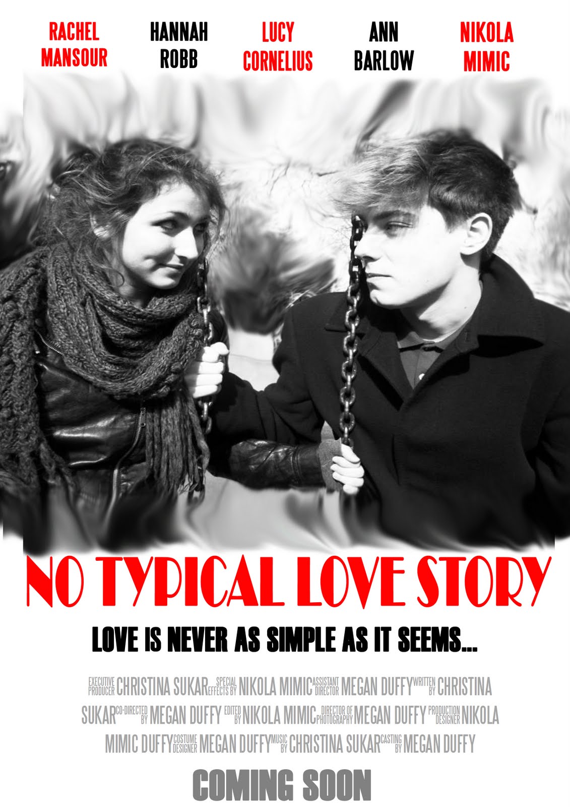
Above is an image of my complete final poster, personally I felt it was successful and adopts some of the codes and conventions found on existing posters in the media to date. I think it's simple layout contributes to is proffessionalism and although its target audience is teenage based it doesnt seclude any other age group or social group, but the selling line helps to address an audience that favour rom- coms. I addressed the actors who participated in our teaser, including their names at the top of the poster, and you can find the main actors on the outside- by adressing the actors in order to conform to codes and conventions. Secondly, I included a film title and tag line, both fonts used look professional and fit the romantic category which Is why I used the colour red as its more often than not associated with love. The tag line informs the audience of the contreversial story line, that the audience should then question, and aims to entice the viewer. No film poster would be complete without a billing box, in this my aim was to address who in the group completed what tasks. The main image doesnt give to much of the story away but hints at romantic elements, introducing the two main characters. It also includes a release date and age rating of 12A- suggesting adult content and light humour, all legal requirments and stating information viewers want to know.
However If I was to do It again i would include the website address, with emphasis on media convergence and I also would have produced more than one poster to have more of a choice but also for bus stops or bus advertisments in order to further advertisement.
WEBSITE

To add the fluidity of my products, I used the same house colours as my poster when creating my website, this then establishes a sense of identity for my film. I also included the same font types and image to avoid confusion, however I have repositioned certain texts and split and added a smudge affect to my image, which was influenced by a poster I reasearched. And to me looks rather professional. It directly addresses the main actors/ actresses and also offers a competition. The billing box and release date are located at the bottom of the page which to is true to life, however this particular image is missing the copyright logo. Given more time I would have created links and extra pages for the website such as images, or a page which tells the story line. The page also offers the chance to visit other social networking sites such as facebook and twitter- these icons are more often then not always found on any website thats aimed for promotion. This increases the publicity and contributes to media convergence.
The black box in the centre of the page is where my teaser trailer shall be embeded.
Teaser (Final)
No typical love story from St Marylebone Media Studies on Vimeo.
The editing of our trailer is finally complete (its step by step production and progression can be found on NIKOLA MIMICS blog) and we are all pleased with the final product. After the feedback from year 12's we made a few editorial changes which we felt were necessary.
Teaser Feedback

Postive
- The storyline was intersting/ entertaining and funny
-Our chosen music complimented our trailer
-The storyline was clear
- Quality of filming was of a professional standard
Negative
-Poor acting in some scenes
- Basic editing, nothing to impressive
-Some scenes were to long in length, need to be more conscise
-At times the music was to loud and dialogue to quiet
We were overall pleased with the feedback and saw minor errors which could be changed, there is a clear storyline that runs throughout however it doesnt give the whole story line away and leaves the audience with unanswered questions which they can only find out after watching the film. The editing is simple but professional including smooth transitions from one scene to another aswell as a voiceover, which made the final product a sucess.
Subscribe to:
Posts (Atom)
